Best Website Design for Dentists
Contents
- Best Website Design for Dentists
- Top 9 Great Dentist Websites
As a dentist, your patients need to trust you with their most defining feature, their smiles. Your skills and reputation in the field can vouch for you but said skills must be presented effectively. A website is the first step in that direction.
Dentist websites are unique in several ways that differentiate them from other types of websites:
- Dental Services: A dentist’s website should provide detailed information about the range of dental services offered, including preventative care, restorative treatments, cosmetic procedures, and orthodontics.
- Patient Education: A dental website should also serve as a resource for patients to learn about oral health and the importance of regular dental check-ups.
- Before and After Galleries: To showcase the results of their work, many dentist websites feature before and after galleries, which demonstrate the transformation that can be achieved through various dental procedures.
- Virtual Consultations: In light of the COVID-19 pandemic, many dental practices have begun offering virtual consultations, which should be highlighted on the website.
- Insurance and Payment Options: Dentist websites should also provide information about insurance and payment options to help patients understand the financial aspects of their dental care.
- Emergency Services: Many dental practices offer emergency services, which should be prominently featured on the website to provide reassurance to patients in the case of a dental emergency.
By highlighting these unique features, a dentist’s website can effectively communicate the breadth and depth of their services and help to attract and retain patients.
Top 9 Great Dentist Websites
1. Smile & Co.
Smile & Co. is a California-based dental practice that aims to make patients comfortable and relaxed while getting treatment. Their website reflects this objective with its soft color scheme and cool design. In addition, the website is easy to navigate and presents the information clearly and easily.
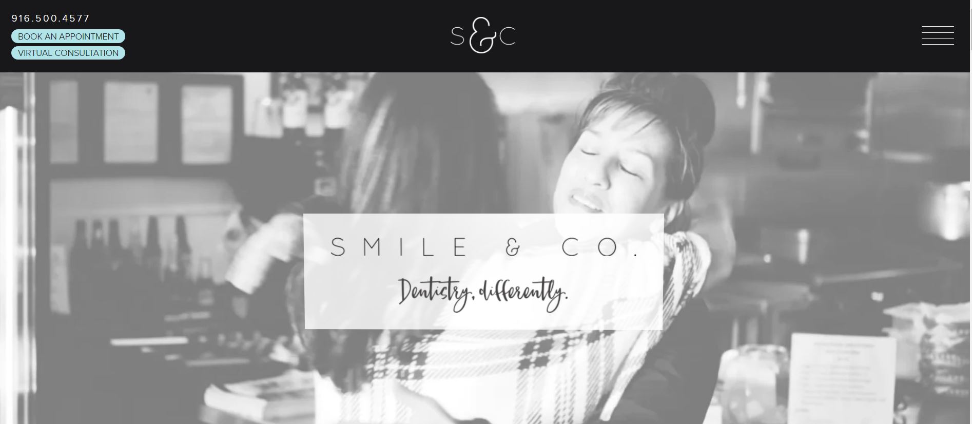
What We Like About It
You will notice the video header when you get to the homepage. The header features a black-and-white video with scenes inside and a caption of the clinic’s name. The top ribbon is filled with the clinic’s logo in the middle and more options on either side. You can use this section to book an appointment or a virtual consultation.
The website uses a drop-down navigation menu, which has several options for you to pay your bills. The following section is a note from Dr. Jones expressing her commitment to building a space patient would love to visit.
Next, we have the discover section that features videos from the clinic, options for a virtual tour, and what to expect on your first visit. There are links to the doctor’s profile, the clinic’s membership plan, and services. The pictures accompanying all these sections familiarize visitors with the clinic and the doctors they’ll be working with.
There’s a section for patient stories so the visitors can look at previous patients’ experiences. The footer is solid black and has links to the clinic’s social media. You can also use the accessibility option here to customize the interface to your preference.
2. Lake Bluff Dental
Lake Bluff Dental has a professional website that is cool to look at and fun to navigate simultaneously. The timeless design is conversation-focused and displays the contact information first. The rest of the website showcases Dr. Griffin’s expertise and the clinic’s services.
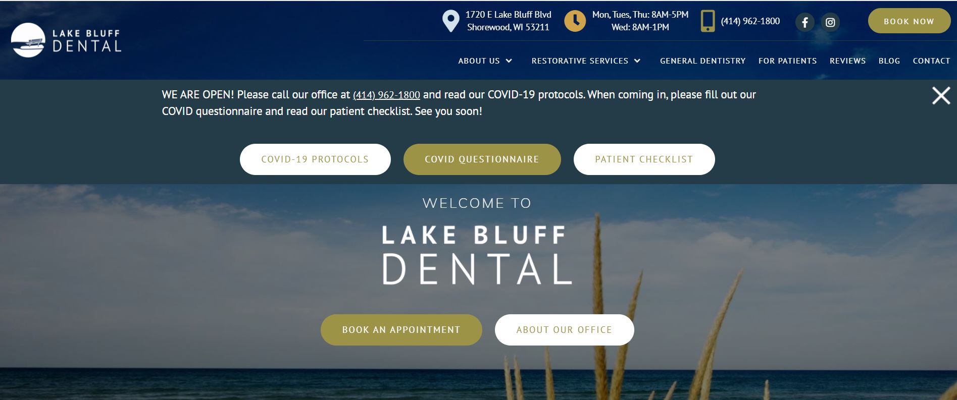
What We Like About It
The website stands out with its comprehensive navigation bar that delivers all the information at the top for those looking to get the clinic’s contact information. This includes the clinic’s location, phone number, working hours, and social media links. You can also use this section to book an appointment. The bar also features options for navigating the actual website.
The banner picture is of the sea and has options for booking appointments and getting more information about their office. Photos from inside the clinic follow this banner. The clinic also writes about how they deliver its services on the website.
If you scroll down a bit more, you’ll see a section about Dr. Griffin and all her certifications. Further below, you can click on an option depending on the type of treatment you are seeking. You can even book an emergency appointment that very day from this point.
The last part of the website covers the patient testimonials and the clinic’s contact information. Finally, visitors can use a sticky accessibility button to change the website interface to something they are comfortable with.
3. Jackson Family Dental
Jackson Family Dental has added a modern touch to its website design. The sleek website, paired with the well-organized information presentation, is a perfect way to draw visitors in. Visitors can get all the information they want, and it builds trust between the clinic and the patients.
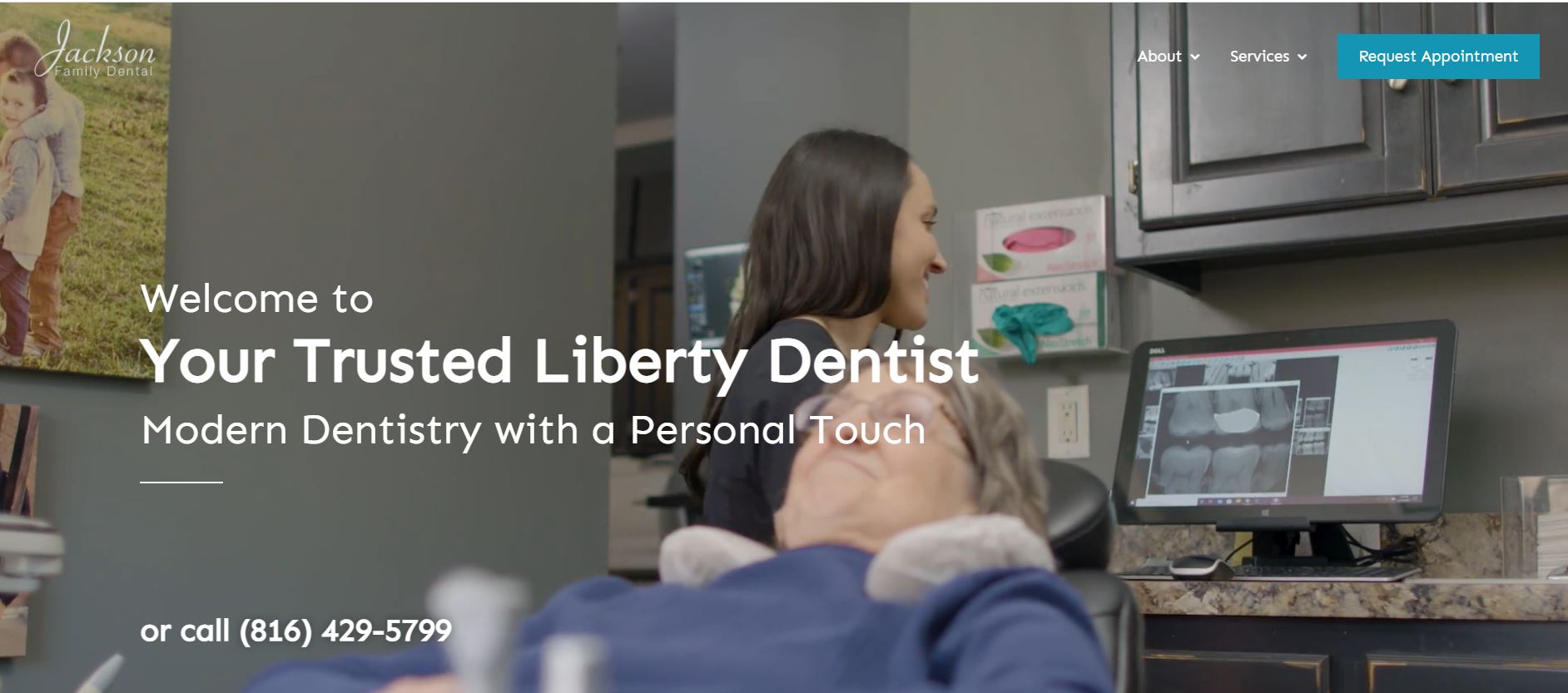
What We Like About It
The website header is a video showcasing the doctor-patient interaction in the clinic. They claim to offer dentistry services with a modern touch, and we can see hints of that modern touch in the website design. For example, the header has a clear call-to-action in the form of a “Schedule Your Visit” option.
The navigation bar itself is sheer, not to obscure the video header. It only has a few options, including an “About” and “Services” section. The left corner has the clinic’s name, and the right corner houses the “Request Appointment” option.
The actual website body starts with a section covering a brief intro to Jackson Family Dental. The following sections cover their state-of-the-art technology and the services they offer.
The testimonial section features reviews from their patients and provides insight into the standard of care here. You can use the website to schedule visits and get their contact information. They also feature their certifications here. The footer has quick navigation links, contact info, and social media links.
4. Mansfield Orthodontics
Mansfield Orthodontics is dedicated to patient care in a manner that makes the patients feel comfortable. With its easy navigation and aesthetic design, you get this feeling from their website. In addition, all the information is presented in clean sections, and you don’t have to waste your time looking for a specific piece of information.
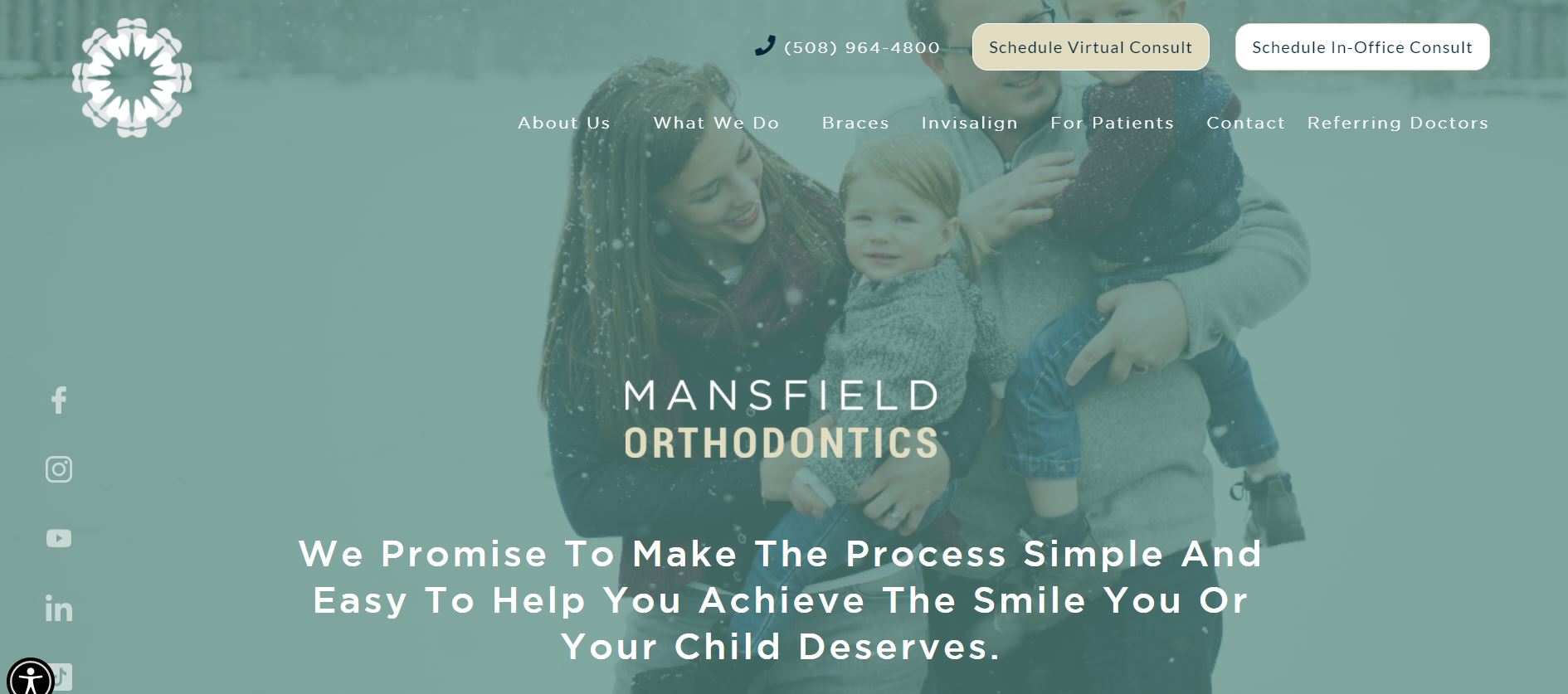
What We Like About It
The website homepage has a backdrop of a green-tinged picture of a family enjoying themselves in the snow. The picture immediately gives the visitors the impression that the practice is family-oriented. In the following section, you can see that Dr. Mindy has been one of the top orthodontists in the Boston magazine. A call-to-action button even allows you to book a free consultation.
The navigation bar features the clinic’s log and contact number. You can even access options to schedule in-office or virtual consults. The bar has all the options for navigating the website. You can see links to all their social media accounts on the left side of the header.
The next section covers Mansfield Orthodontics’ approach to patient care. A gallery section with pictures of the clinic and Dr. Mindy follows this. They also give you options to access treatments that they offer. We also have a welcoming statement from Dr. Mindy and all her certifications.
You can see the free consultation procedure, which is a great marketing tactic. They also display which charity they donate to for every patient they treat. The last section of the website covers patient testimonials and their contact information. There’s also a google add-in handy for getting directions to the center.
5. North Beach Dental Care
North Beach Dental Care has a cheery and fun website design. The soft color scheme and the homely pictures give a great look to the website. The website is easy to navigate with toned-down special effects. The website alone makes you feel like you are not in a clinic but a lovely suburban home.
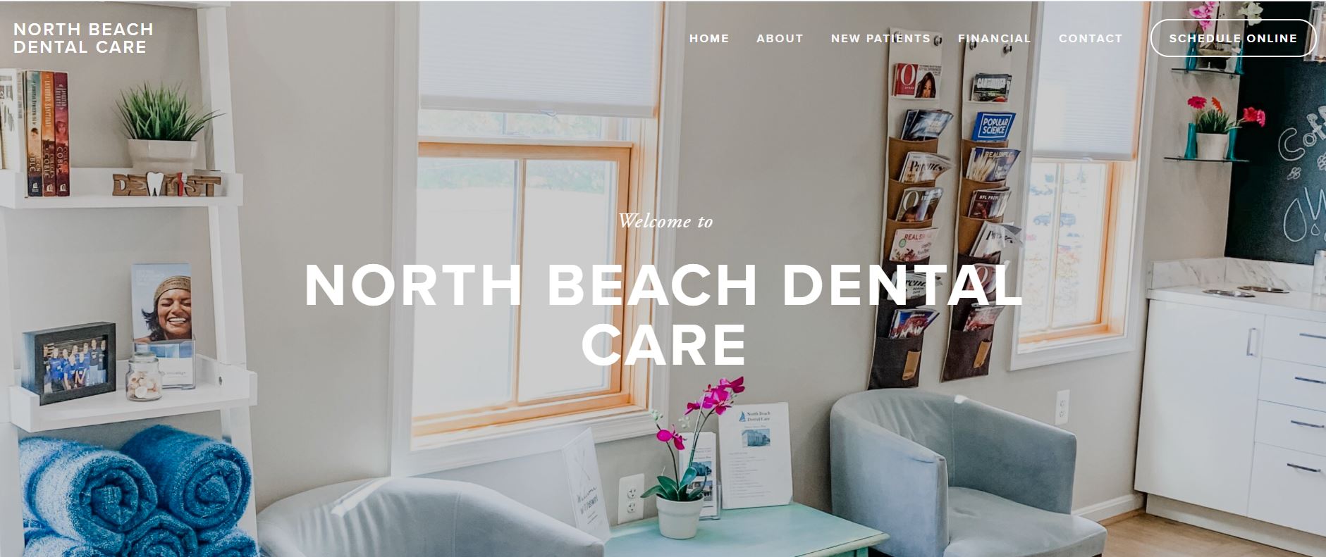
What We Like About It
The banner picture on the homepage features the clinic’s waiting area and is decorated refreshingly with an excellent view. The caption welcomes visitors to the center. The navigation bar is simple to navigate. It has options for getting to the clinic, registering as a new patient, and financial and contact pages. You can also schedule an online consultation here.
Below the header, you can see pictures of the clinic’s team and more pictures of the care center. It also has a statement from Dr. Dersley promising care for the patients without judgment. There’s another section explaining the care offered at the North Beach Dental Care Center, along with an introductory video.
The footer is solid black and has options for navigating the website. At the very bottom is the clinic’s address, phone number, and email address. You can also find the link to their Facebook handle here.
6. East Indy Dental Care
East Indy Dental Care has opted for a more retro look with its bold color scheme and grayscale pictures. The website is very comprehensive, and visitors can get to know everything about the clinic through their website. The website doesn’t lose any points in terms of functionality either, as users can do anything from paying their bills to requesting an appointment here.
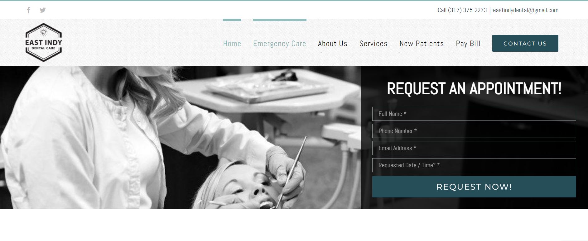
What We Like About It
The homepage header is unique because it isn’t just a picture or a video. Instead, the header features an image of a patient and the appointment scheduling form.
The navigation is easy, too, as it has the contact information and social media links in the top strip. The lower section is dedicated to a website navigation menu and happens to be a sticky menu. The sticky menu means visitors don’t have to scroll up and down to access it.
The following section contains Dr. Sarah’s statement proclaiming her love for her profession. Directly below is the testimonial section, which features Google reviews for the dental care center. There’s also a description of how things operate at the East Indy Dental Care center and why they are the best option for their patients. The BBB accreditation and ranking certainly help in building credibility.
The rest of the website covers their services and how they can help their patients. The bottom of the website has their contact information and their working hours. The footer has the usual terms and conditions, privacy policy, and notice of nondiscrimination.
7. Del Mar Dental Studio
Del Mar Dental Studio has one of the more soothing color schemes. The cool blue color scheme enhances the aesthetic value of the website. However, that does not detract from the website’s functionality. It has all the required information and an online appointment booking option.
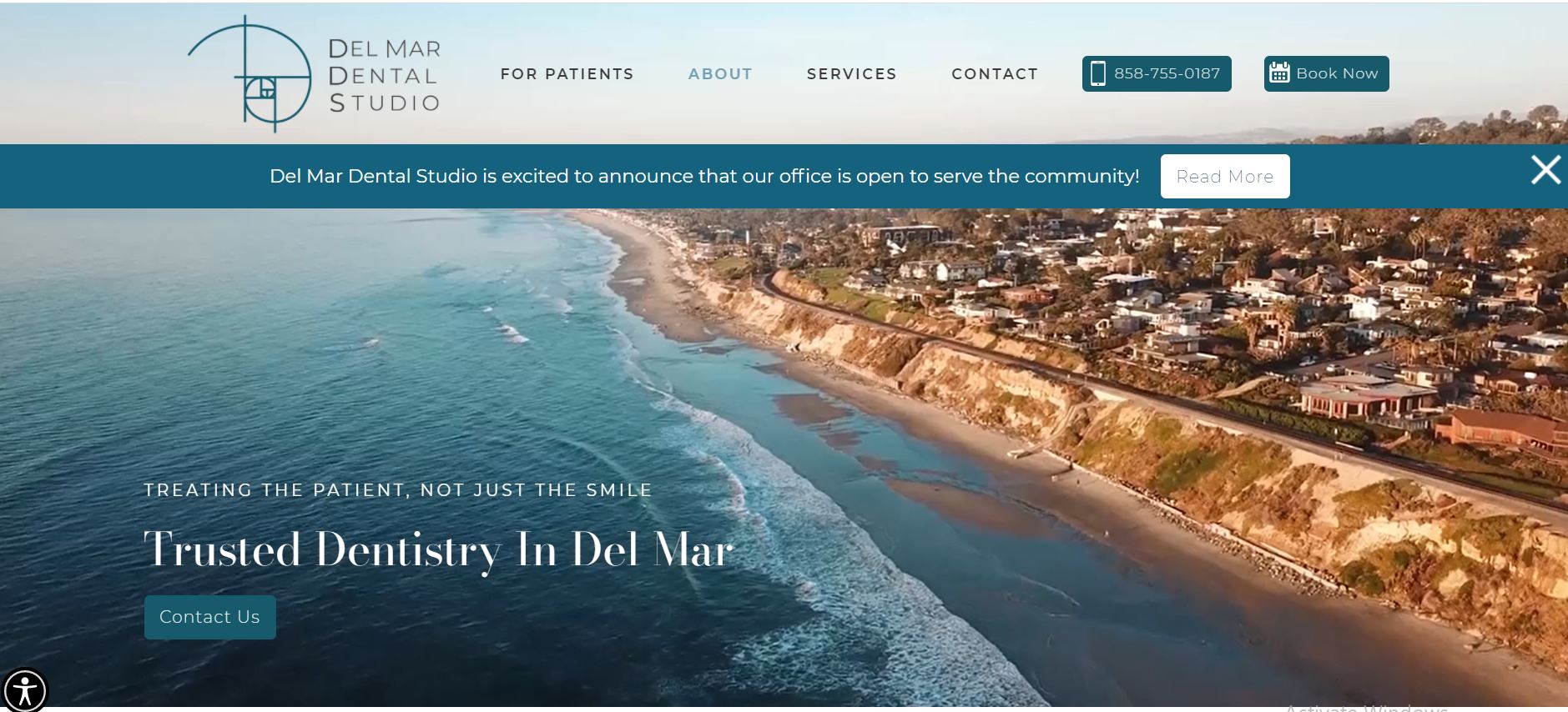
What We Like About It
The header is a panoramic video of the beachside with a “Contact Us” option. The sticky navigation bar has the studio’s logo and navigation options. You can also contact them or book an appointment through the bar itself. All announcements are displayed on a top strip. There’s also an accessibility option on the bottom left corner of the website. The good news is that the button is sticky, so you don’t have to spend time looking for it.
The website body begins with a brief introduction to the dental studio and a picture of the doctors. They also highlight the precautions they have taken on reopening the center. You can choose what you want by clicking on the links between cosmetic dentistry, general dentistry, and airway dentistry.
Next, we have the doctor profiles with all their certifications. Additionally, there’s a testimonial section featuring the patient’s experiences. The website also displays some before and after pictures.
The last part of the website covers the studio’s address and a google add-in to help patients find the directions. They also display other contact info like phone numbers, social media handles, and email.
8. Elegant Dentistry
Elegant dentistry claims to focus on putting out a friendly persona that patients can easily approach. Their website reflects their passion for care and has the potential to make visitors feel comfortable. The backdrop of the pictures is alluring as it highlights their primary goal. Moreover, the website is user-friendly in navigation, making it easy to find all the needed information.
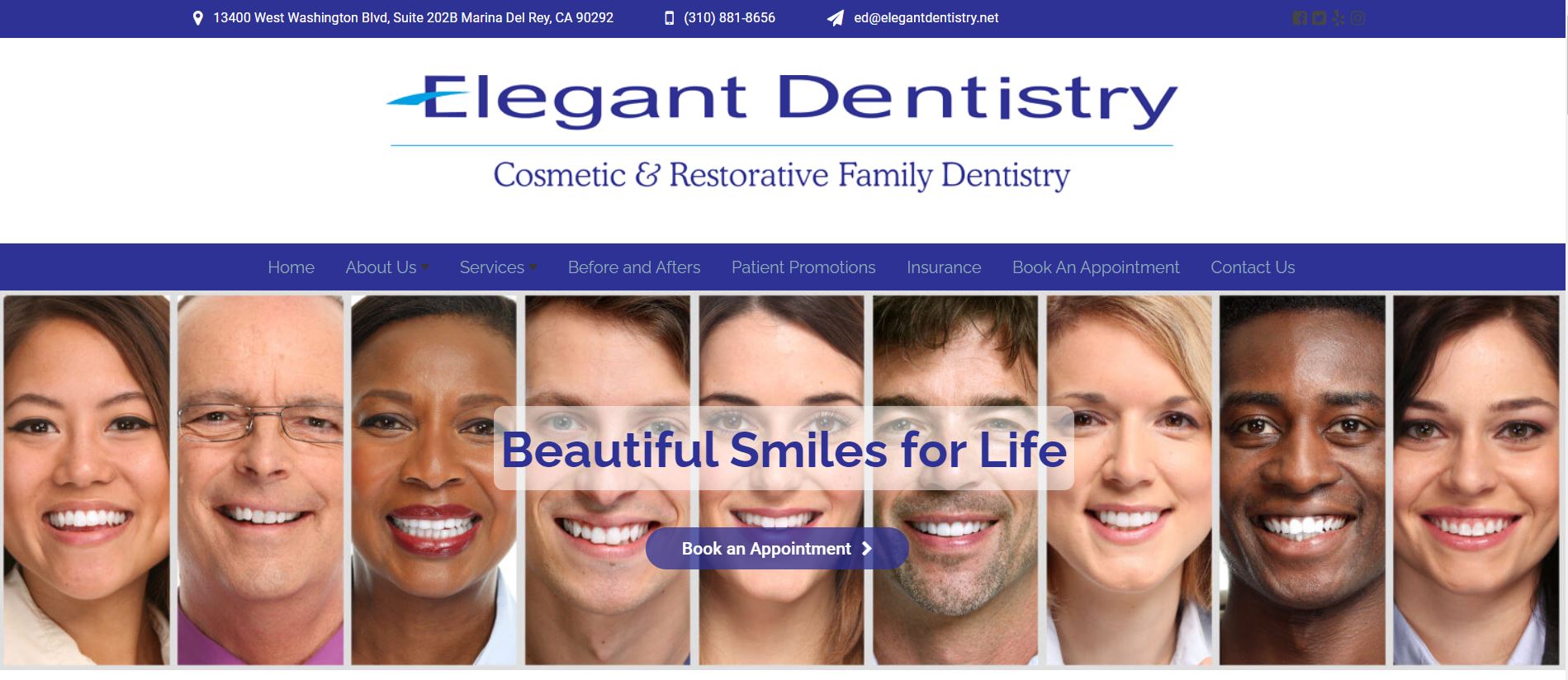
What We Like About It
The navigation bar at the top has the clinic’s logo and name in the left corner. The right corner has options for navigating the web pages like home, new patients, patient, reviews, appointments, and contact us.
The header image features the clinic’s team; you can see it fully as you scroll down. There’s also a caption declaring that they genuinely care about the patients. The following section is dedicated to introducing the team. You can get more details by clicking on the read more option.
The website also showcases their office location along with their address. There’s also a google add-in that people can use to get there. The last section covers the services. They have categorized the services into cleaning and prevention, cosmetic dentistry, dental implants, restoring teeth, and other services.
The footer has its privacy policy and social media handles. It also includes their address and contact number.
9. Andrew McCormick DDS
Andrew McCormick DDS has been voted the best cosmetic dentist in Santa Rosa and looking at their website, you can see why. The website incorporates a pastel color scheme which makes it look cheery. The navigation is easy, with all the information presented in neat sections that make it easy to understand.
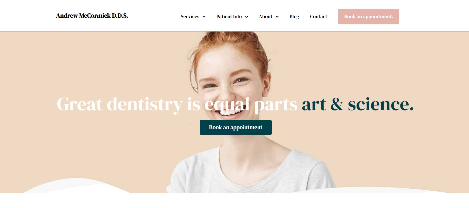
What We Like About It
The website header is unique and features a smiling woman with a bright pastel background. There’s a clear call to action for booking appointments. The navigation bar is at the top of the website and has options for navigating the website. Some options reveal drop-down menus if you hover your pointer over them.
Below the header, you’ll see Dr. Andrew’s profile. You can get a more detailed profile by clicking on the option there. In addition to that, the website also displays his achievements directly below that.
There’s information on the organizations that the clinic is affiliated with. Only the top three dental services are shown on the homepage. You can access the complete list by clicking on the option below. You can also access information on the office and its photos here.
In the end, you’ll see the testimonial section and a form that you can use to book an appointment. There is a google add-in you can use to get directions. The footer at the end of the website has the clinic’s contact information, including their address, number, and social media links. There’s also a list of the dental services they offer here. You can click on any of them for more information.
Best Practices for Dental Websites
When building a website for a dental practice, there are several important considerations that a dentist should keep in mind:
- User Experience: The website should be user-friendly and easy to navigate, with clear calls to action and accessible information about the practice and its services.
- Design: The website should have a professional and modern design that reflects the quality of the dental practice.
- Content: The website should provide comprehensive information about the practice, its services, and the dentists and staff. This information should be well-written and easy to understand.
- Search Engine Optimization (SEO): The website should be optimized for search engines, with relevant keywords and meta descriptions, to improve the practice’s visibility in search results.
- Responsiveness: The website should be optimized for viewing on various devices, including desktop computers, laptops, tablets, and smartphones.
- Patient Reviews: The website should provide a platform for patients to leave reviews, which can help to build trust and credibility with potential patients.
- Contact Information: The website should display the practice’s contact information, including its address, phone number, and email.
- Online Scheduling: The website should allow patients to schedule appointments online, improving the practice’s convenience and accessibility.
By keeping these considerations in mind, a dentist can build a website that effectively promotes their practice and helps to attract new patients.
Conclusion
So, that concludes our list of the best dentist websites on the internet. You can take these as inspiration for developing your website. Certain elements make your website look professional and credible. You can include a few things to improve your website design, such as adding any partners or accreditations your clinic might have. This gives your practice the credibility that people want.
We also recommend adding a testimonial section that lists reviews from your past patients. That way, you can provide some real insight into the workings of your clinic. Furthermore, adding a booking option and paying bills online is always a good idea for additional functionality. That’s it for our little nuggets of wisdom. We hope you can make the most of these and design the perfect website.